
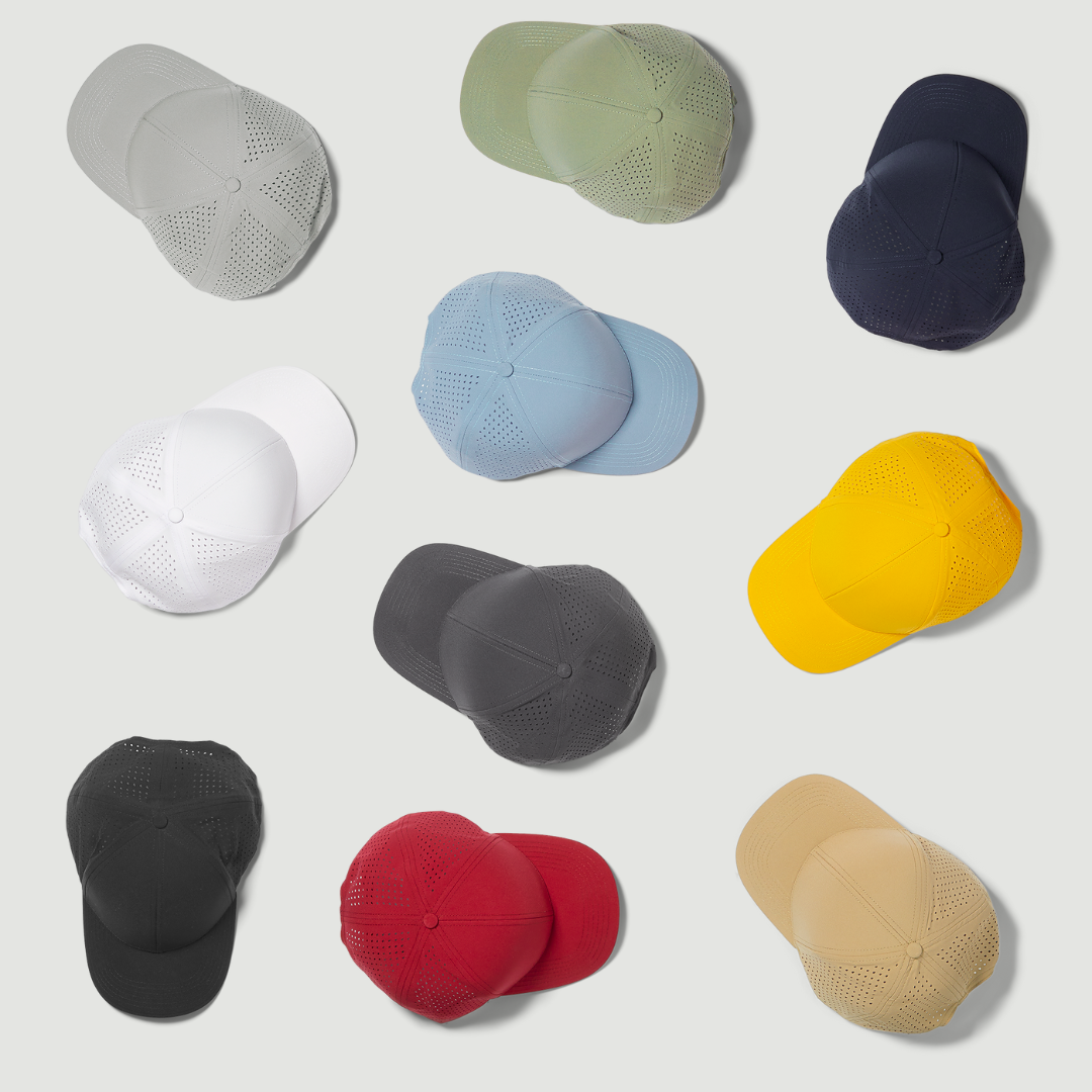
The Psychology of Neutral Colors | GRACE Journal #003
Category: Style
Reading Time: 4 minutes
____________________________
The Psychology of Neutral Colors
Some colors ask to be noticed.
Others simply belong.
Walk through an art gallery, a thoughtfully designed home, or a wardrobe built over many years, and you'll notice a familiar pattern.
Beige.
Stone.
Navy.
Gray.
Olive.
Black.
White.
These colors rarely dominate a room.
Yet they often define it.
Their appeal isn't built on novelty.
It's built on balance.
Why Our Eyes Appreciate Restraint
Not every color demands the same amount of attention.
Neutral tones tend to create visual harmony because they compete less with one another.
Instead of becoming the focus, they allow shapes, materials, textures, and proportions to take center stage.
Designers have understood this for decades.
Architecture, industrial design, interior spaces, and luxury products often rely on restrained palettes—not because they're safer, but because they allow the object itself to speak.
Sometimes, less color reveals more design.
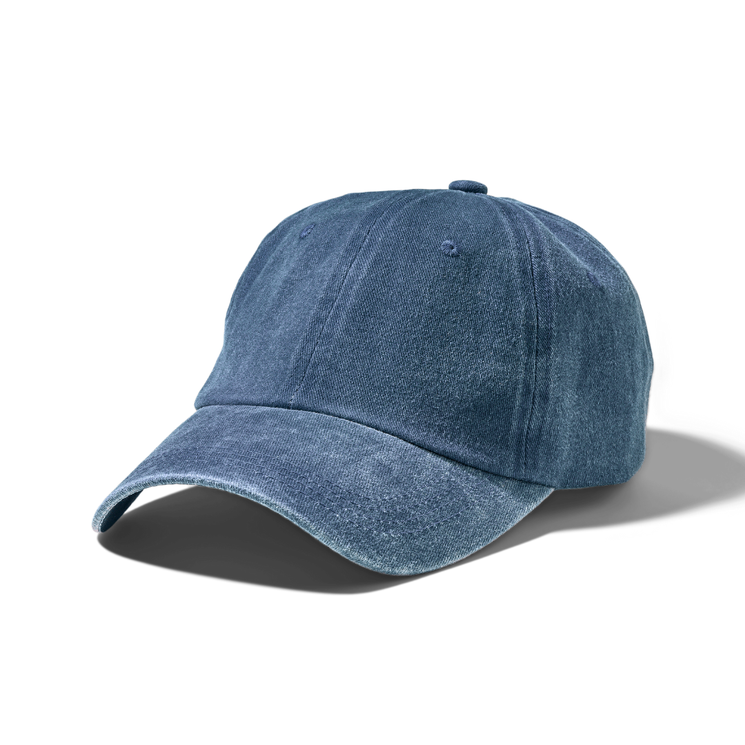
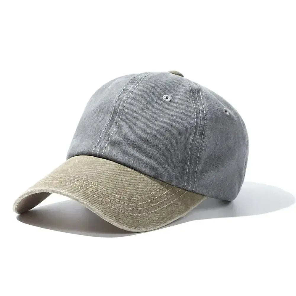
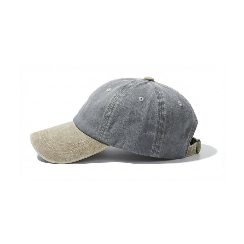
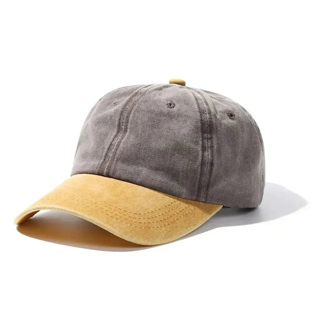
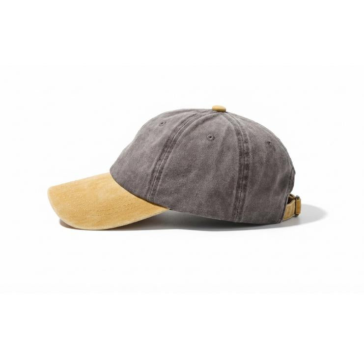
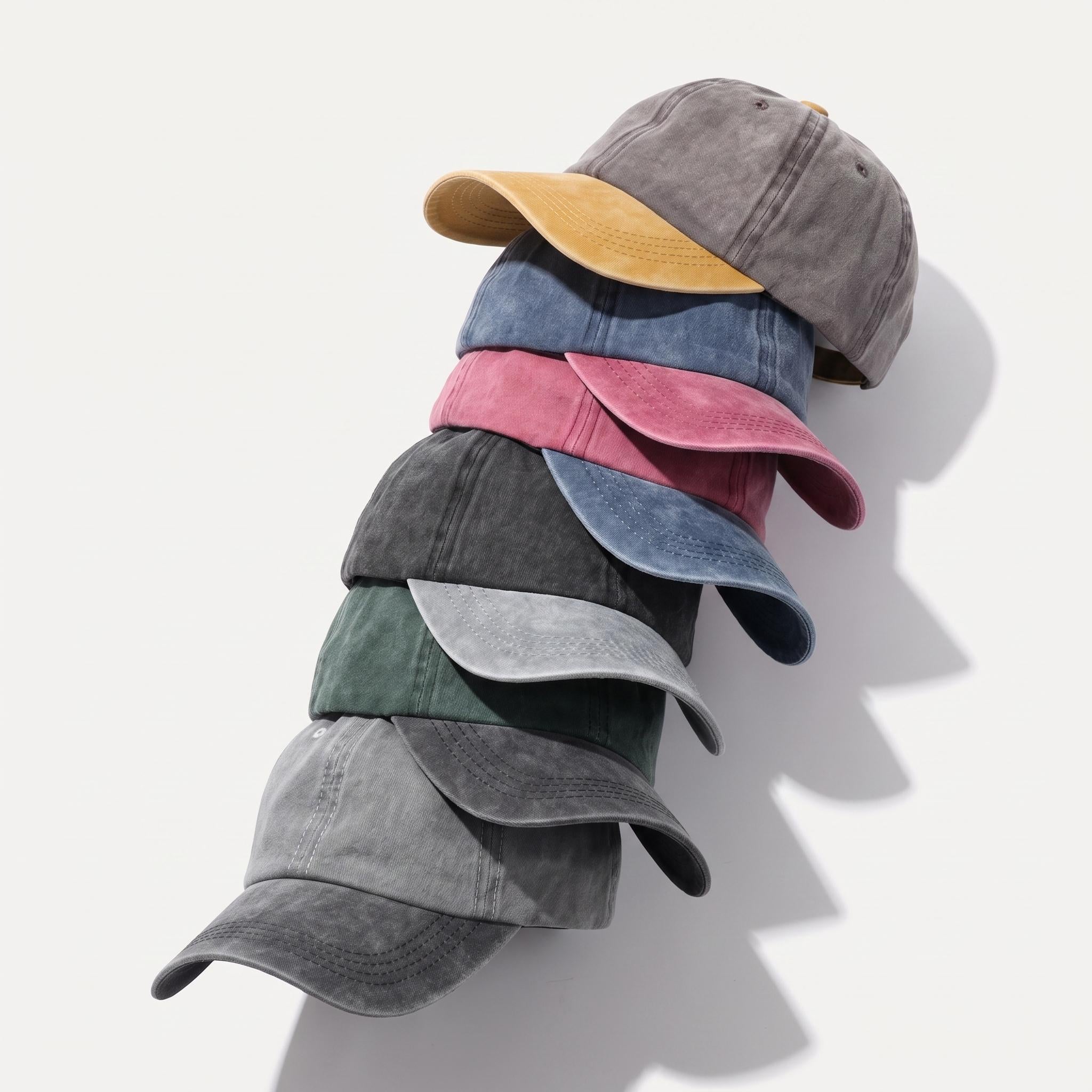
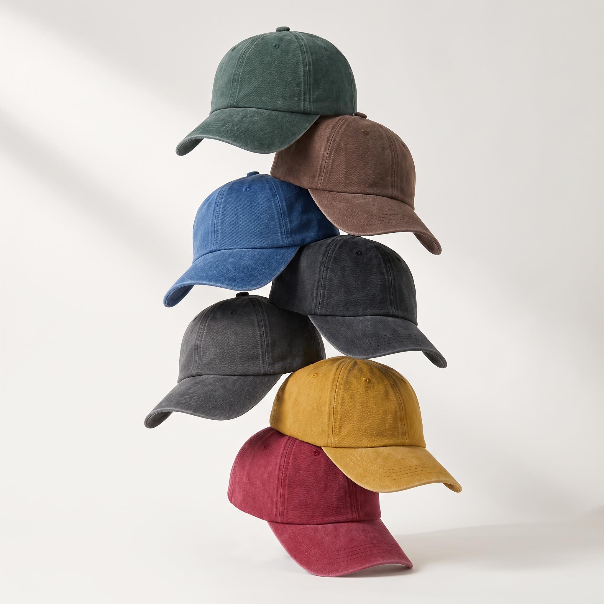
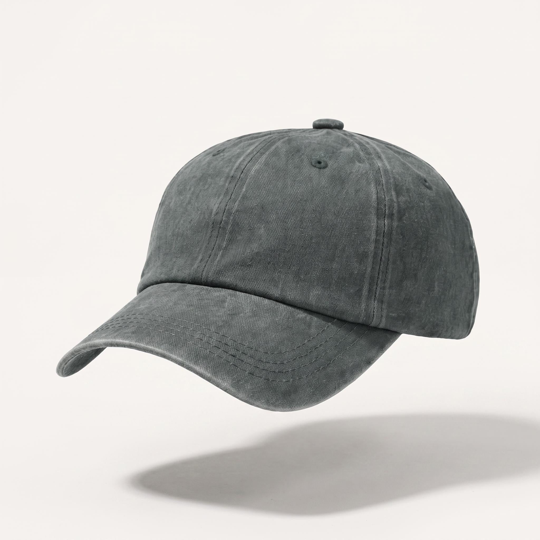
This is exactly the thinking behind our GRACE Classics line — tones like Heritage Brown, Ash Stone, and Deep Atlantic were chosen precisely because they never compete for attention. They simply work, every time you put them on.
Confidence Doesn't Need to Be Loud
Bright colors have their place.
They celebrate energy, personality, and spontaneity.
Neutral colors communicate something different.
Consistency.
Restraint.
Quiet confidence.
They rarely seek attention.
Instead, they allow the person wearing them to become the focus.
That may explain why architects, photographers, designers, and many creative professionals naturally gravitate toward neutral wardrobes.
The clothing supports their identity rather than competing with it.
Simplicity Creates Versatility
One of the greatest strengths of neutral colors is how naturally they work together.
Stone complements navy.
Olive softens black.
Gray balances white.
A wardrobe built around these tones requires fewer decisions because almost every piece belongs with another.
That simplicity isn't about owning less.
It's about choosing better.
Many of the most enduring wardrobes are surprisingly small.
Not because they lack variety.
Because every piece earns its place.
Why They Rarely Feel Dated
Fashion is constantly introducing new colors.
Some become synonymous with a particular decade.
Others quietly remain.
Neutral colors have an unusual ability to transcend trend cycles because they aren't trying to define a moment.
They simply adapt to it.
A well-made jacket in stone.
A charcoal sweater.
A navy cap.
They feel just as natural today as they did years ago—and likely will years from now.
Timelessness is often less about innovation than about restraint.
Designing for Everyday Life
At GRACE, color is never chosen simply because it is fashionable.
It is chosen because it belongs.
Neutral tones allow a cap to become part of everyday life rather than the center of attention.
They pair naturally with what people already wear.
They age gracefully.
And they remain relevant long after seasonal trends have disappeared.
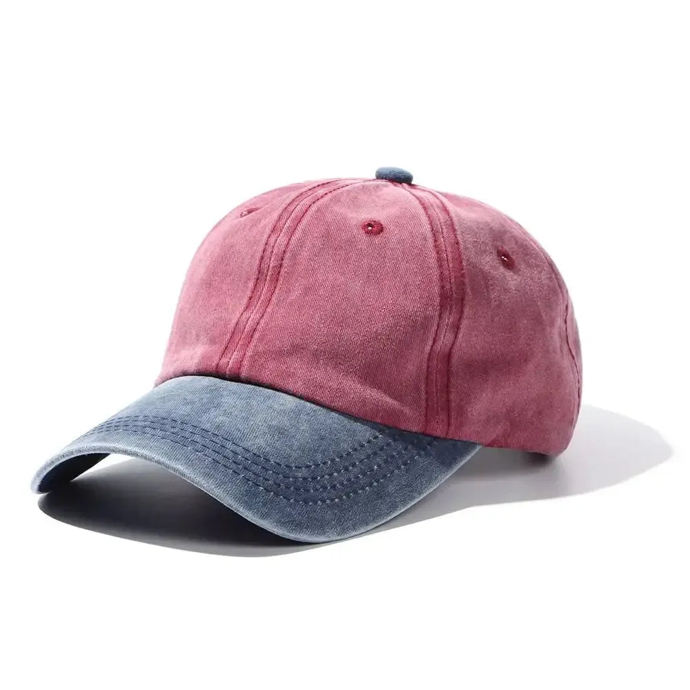
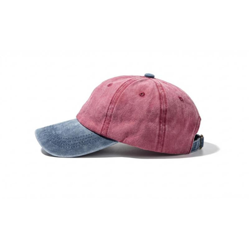
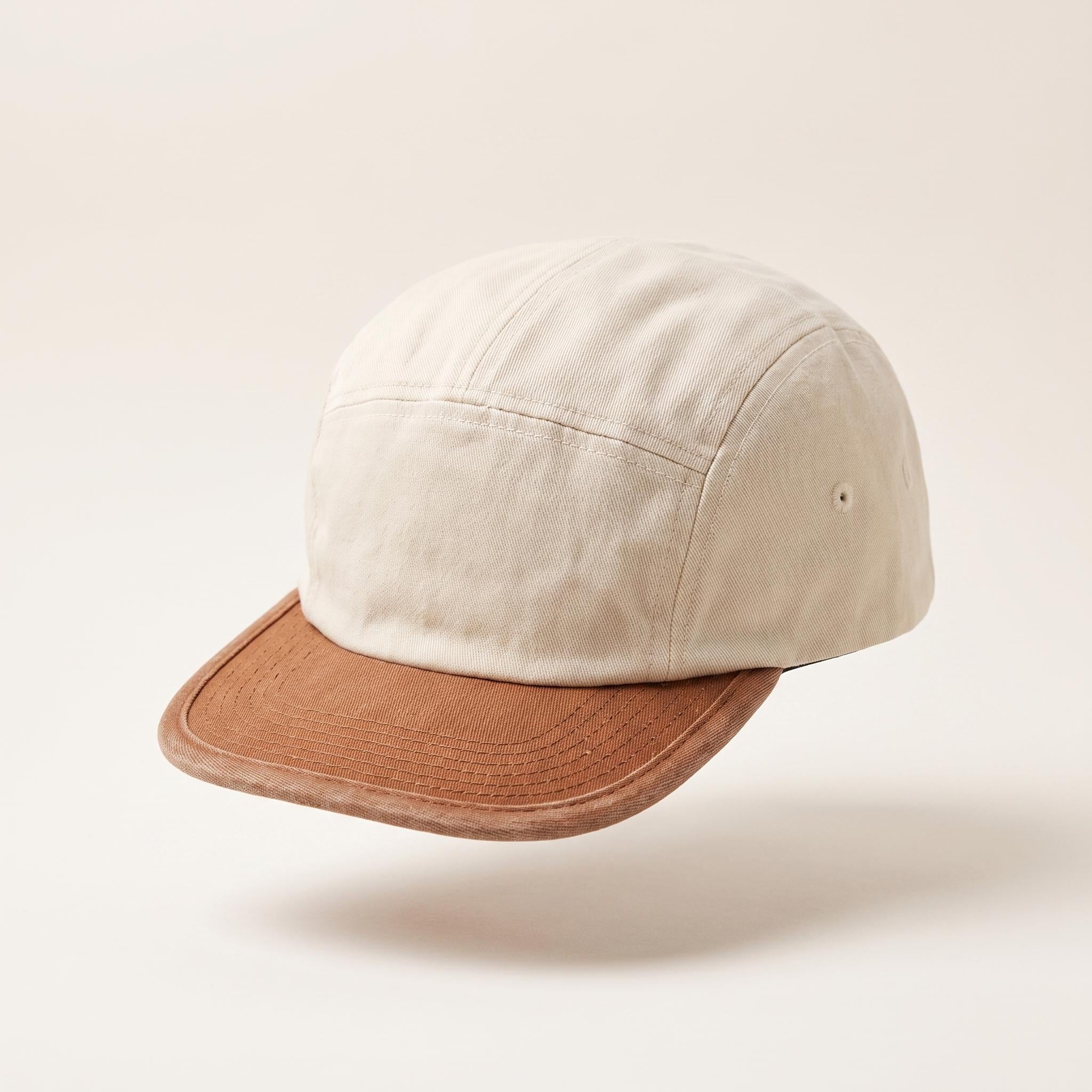
Explore timeless colorways across the GRACE Collection, discover understated classics like the GRACE Classics, or browse subtle combinations such as Navy Stone, Amber Navy, and Silver Sky.
The best colors rarely ask to be noticed.
They simply become part of who we are.
Because timeless style isn't built on constant change.
It's built on thoughtful consistency.
By The GRACE Editorial Team
Published July 21, 2026



Leave a comment
This site is protected by hCaptcha and the hCaptcha Privacy Policy and Terms of Service apply.